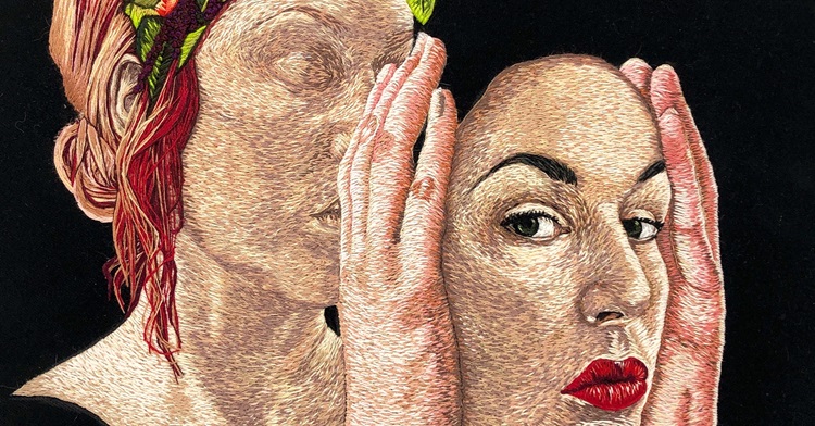
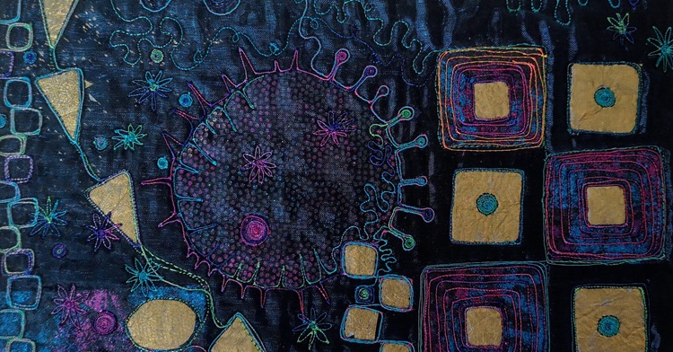
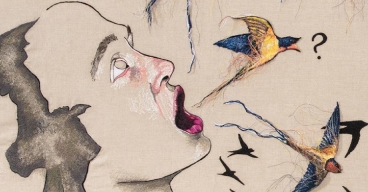
From intimate thread sketches to large, impactful embroidered pieces, the artworks Jess De Wahls makes are bold, contemporary and intensively…
A place for textile and fiber artists to be inspired, learn from the best, promote their work & communicate with like-minded creatives.
From intimate thread sketches to large, impactful embroidered pieces, the artworks Jess De Wahls makes are bold, contemporary and intensively…
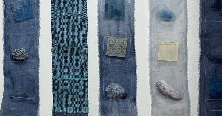
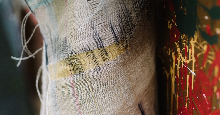
Amanda Britton and Johanna Norry usually create work on their own, using a mix of techniques and processes. But in…
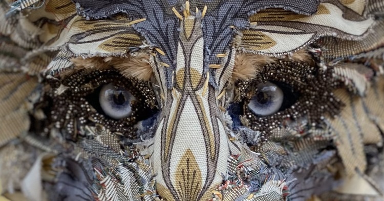
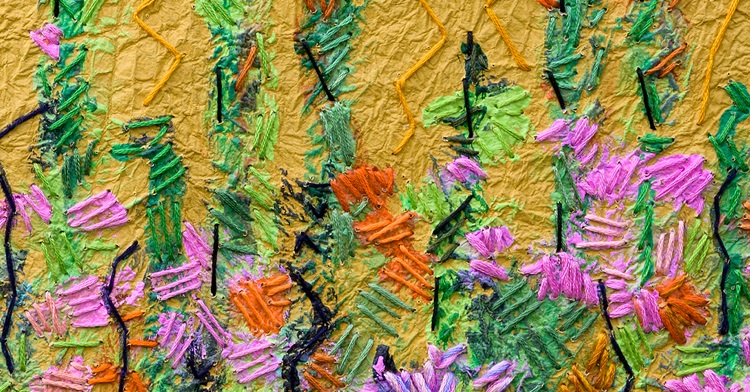
The textile menagerie of Bryony Rose Jennings is filled with a variety of ‘beasties’, whose charms are irresistible. From mice…
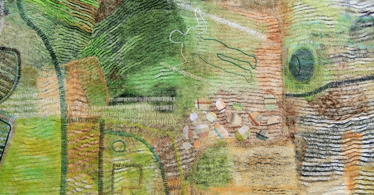
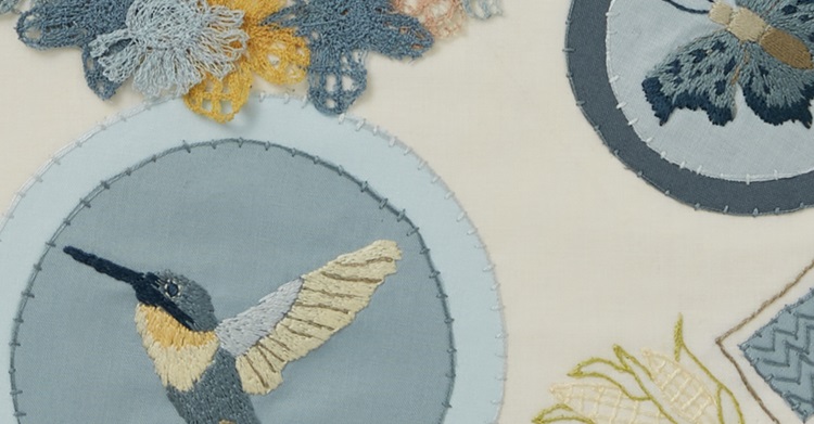
As artists we don’t have to look far for inspiration. Nature in all its resplendent glory – and never far…
It’s said that curiosity is the mother of invention – and it’s certainly the driver behind Angie Hughes’ richly layered…
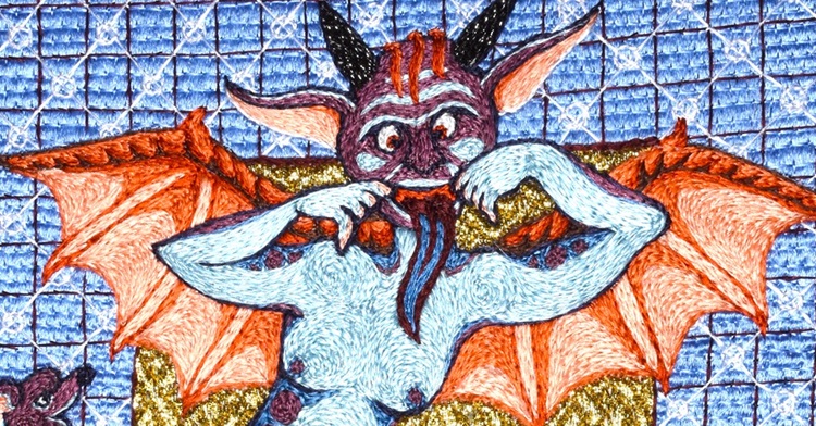
Did you know that medieval embroidery can be humorous and a little risqué? Take a look at Tanya Bentham’s unique…
Mary Beth Schwartzenberger intends to make a scene. Literally. She loves filling blank walls with what she calls ‘roomscapes’ that…
‘There is beauty in everything, Just not everybody sees it.’ Andy Warhol In the eyes of textile artist Kate Whitehead,…
Mixed-media artist Alison Carpenter-Hughes’ work could be described as extreme stitching. She specialises in free motion embroidery and textiles and…
When she’s not in her studio, Lindsay Olson can often be found canoeing with her husband on one of Chicago’s…